Hi everyone! This is a super overdue review from last year’s haul. I will be covering two products: Kusakabe Watercolor set of 98 and the Holbein Clester Watercolor Paper.
Kusakabe Watercolor
First Impressions first. Not gonna lie, what attracted me to this set is the price point. This set is relatively cheaper compared to other brands who sell large sets such as Sennelier or Schmincke. Kusakabe is a Japanese brand and manufactured in Japan product. This fact, plus it was sold in Sekaido, which btw, sells the cheapest art supplies, are probably the primary reasons for its friendly price point.

At a glance, this set may seem plentiful but upon swatching the paints, a lot of the colors are very similar to each other and even have identical pigments. If you are not a seasoned artist, you may find the differences very trivial.
These are my general observations:
- A lot of tint colors – Tints are any paint or color plus white. To be honest, I am not surprised. In my experience of using Japanese brands, they have a tendency to include these tints because of Japanese paintings alla prima like methods.
- Mostly non single pigments – This set is quite unconventional with a lot of quirky colors. Single pigments are the usual classic western colors such ultramarine and umbers. What they claim as “natural cadmium colors” labeled as “cadmium neo” are actually a mix of pigments.
- Have unlisted pigment codes – Self explanatory. Pigments marked as N/A are unlisted by most pigment chart sites such as handprint.com.
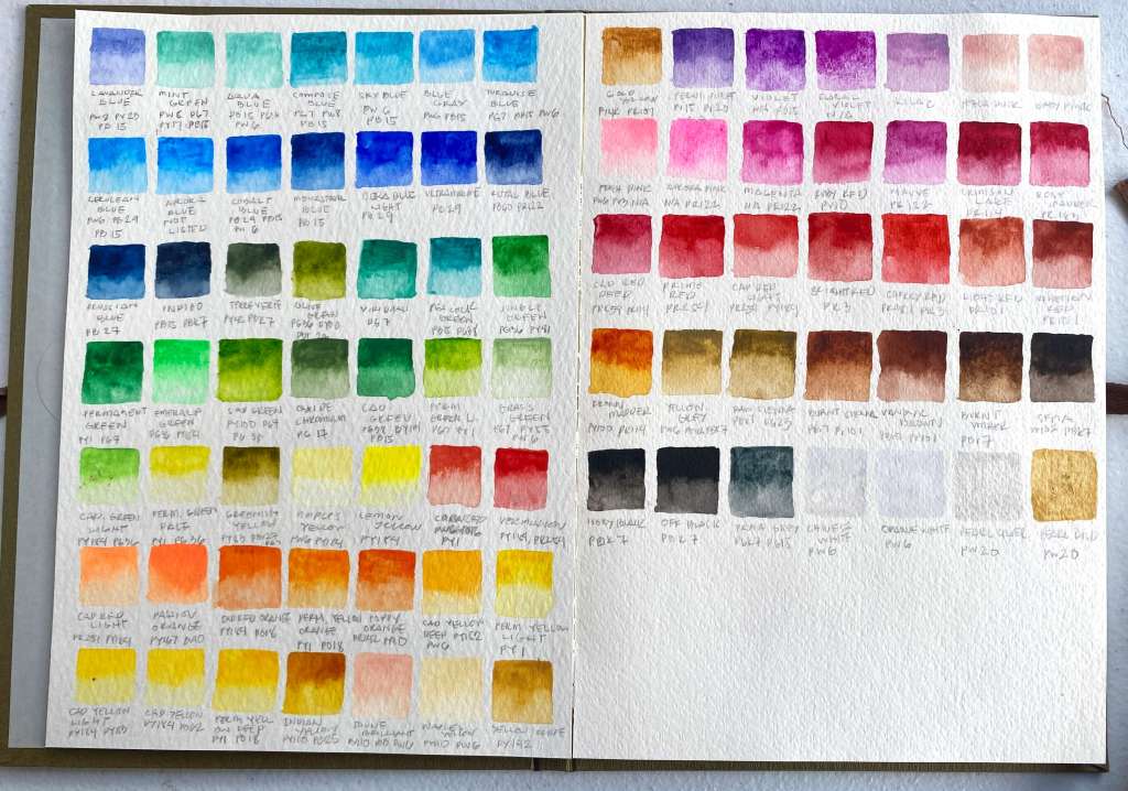
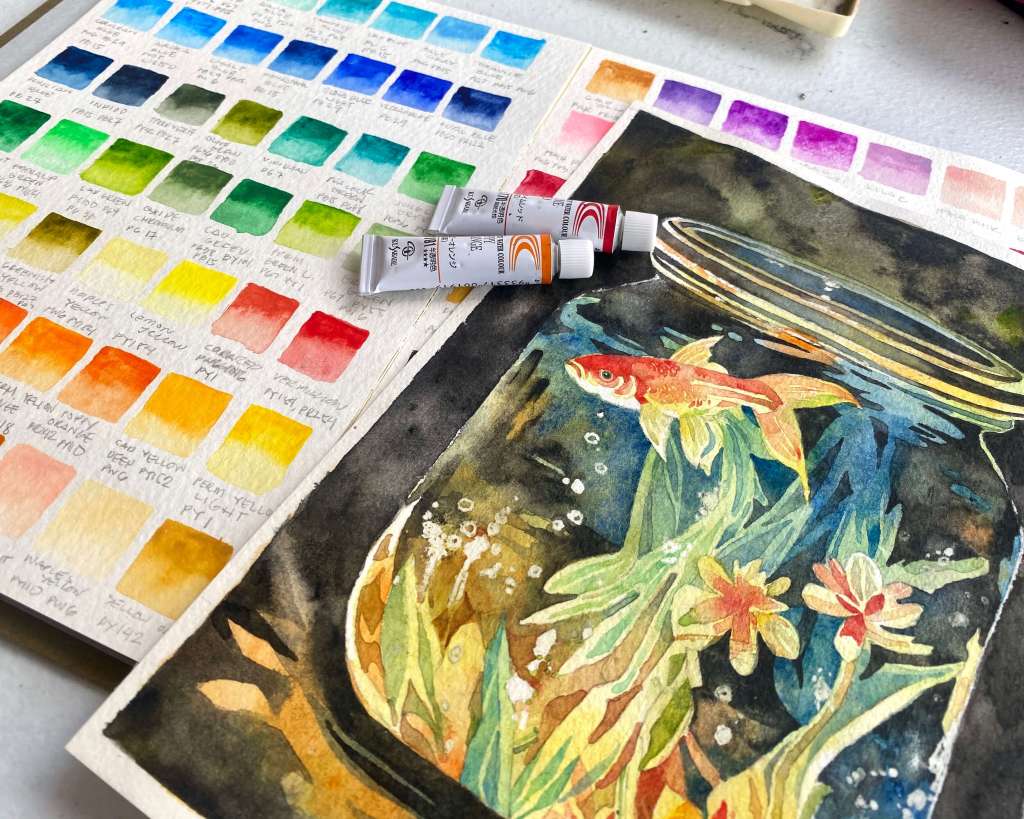
Summary of Colors
Blue Family
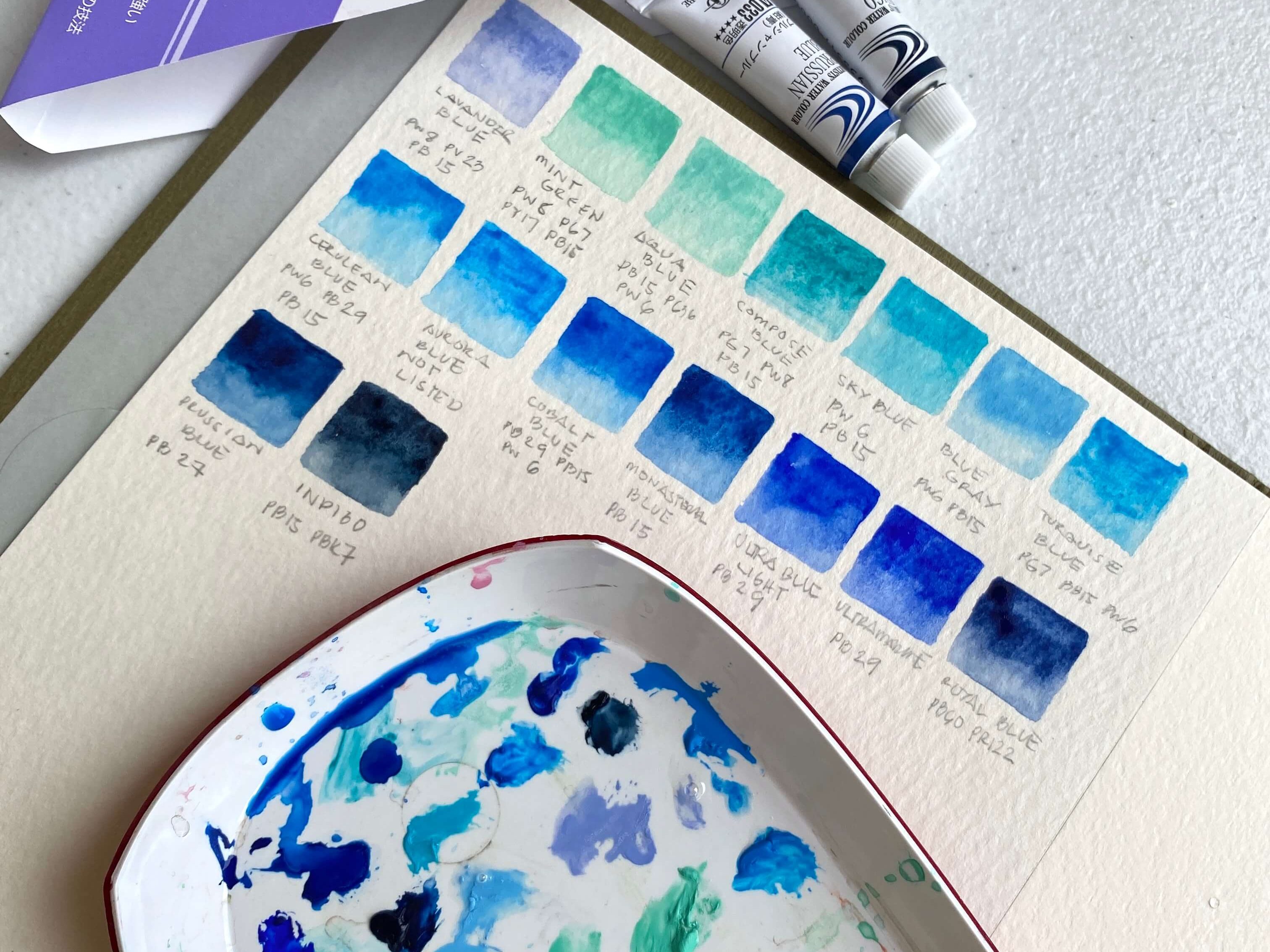
Majority of the colors have multiple pigments save for our classic Ultramarines, Prussian Blue, and Phthalo Blue (named as Monasteral Blue in this set). Almost 50% of the color are tints or contain the color white. I think these are great for skies. Also, I observed that blue opaque tints tend to make better digitized digital copies than their transparent counterparts. The blues also have a good range from pastel to darks and warm to cools.
Green Family
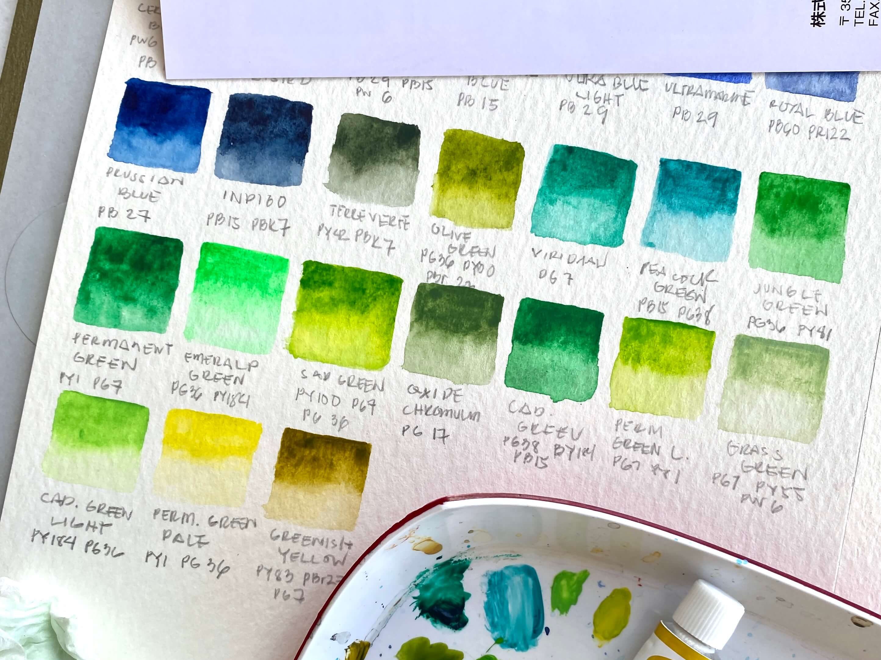
Only one is a single pigment color namely “Viridian”. A bunch of the greens are something I can also find in Holbein Watercolors but not in Western brands such as: such as Jungle Green, Oxide of Chromium, and Greenish Yellow. I find their green shades a little strange or at the very least quirky because some colors are kind of far to the greens I used in seeing. Permanent green light and greenish yellow look more yellow than green. Greens are just convenience colors to me because I tend to mix it from scratch. I honestly don’t mind the strangeness to this set.
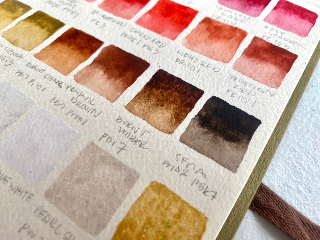
Reds, Yellows, Oranges, Pinks and Purples
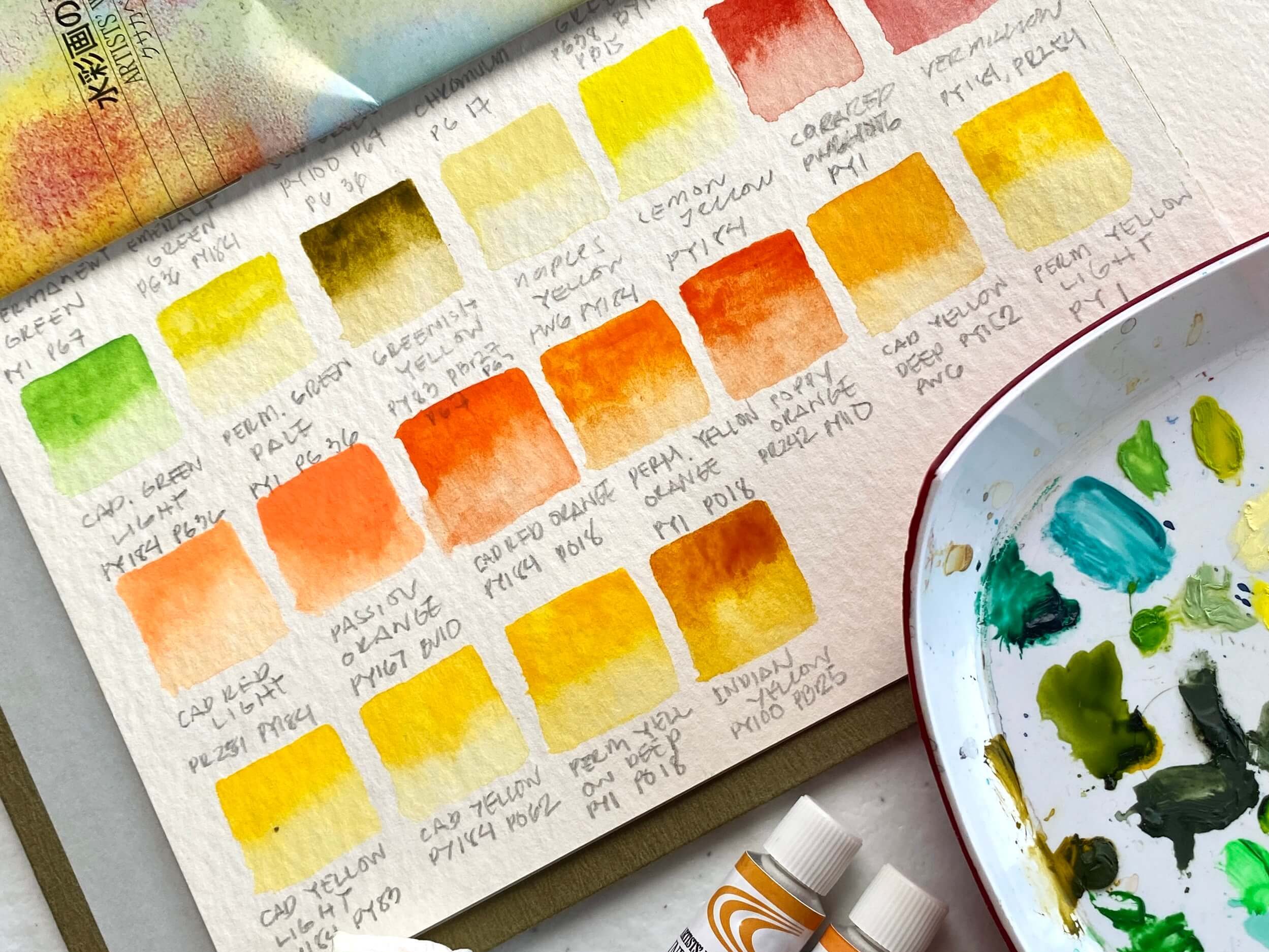
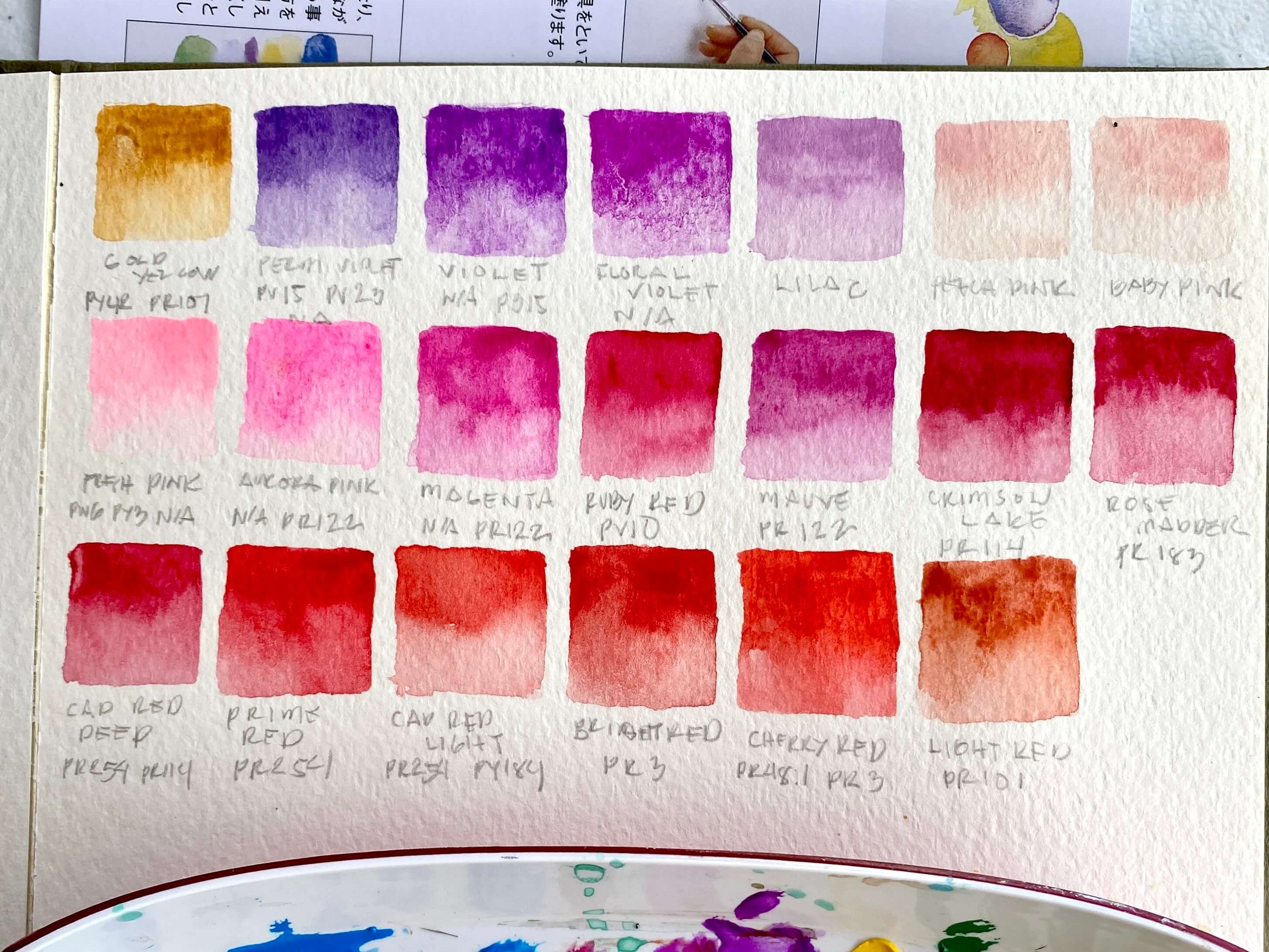
Among the color sets, I’m more meticulous to my reds, oranges, yellows and pinks since my works are leaning toward the warm spectrum. I would prefer a lot of single pigments on this color range only to find myself disappointed. However, despite it mostly multiple pigments, there are reliable single pigments of yellow such PY1 and reds such as PR254,PR122. I’d take these out of the set and add it to my set of paints that I use for exhibit or commission work. The purples are also disappointing since they contain unlisted pigments. The rest I don’t like will be used for reproduction work.
Blacks, Browns, and Neutrals
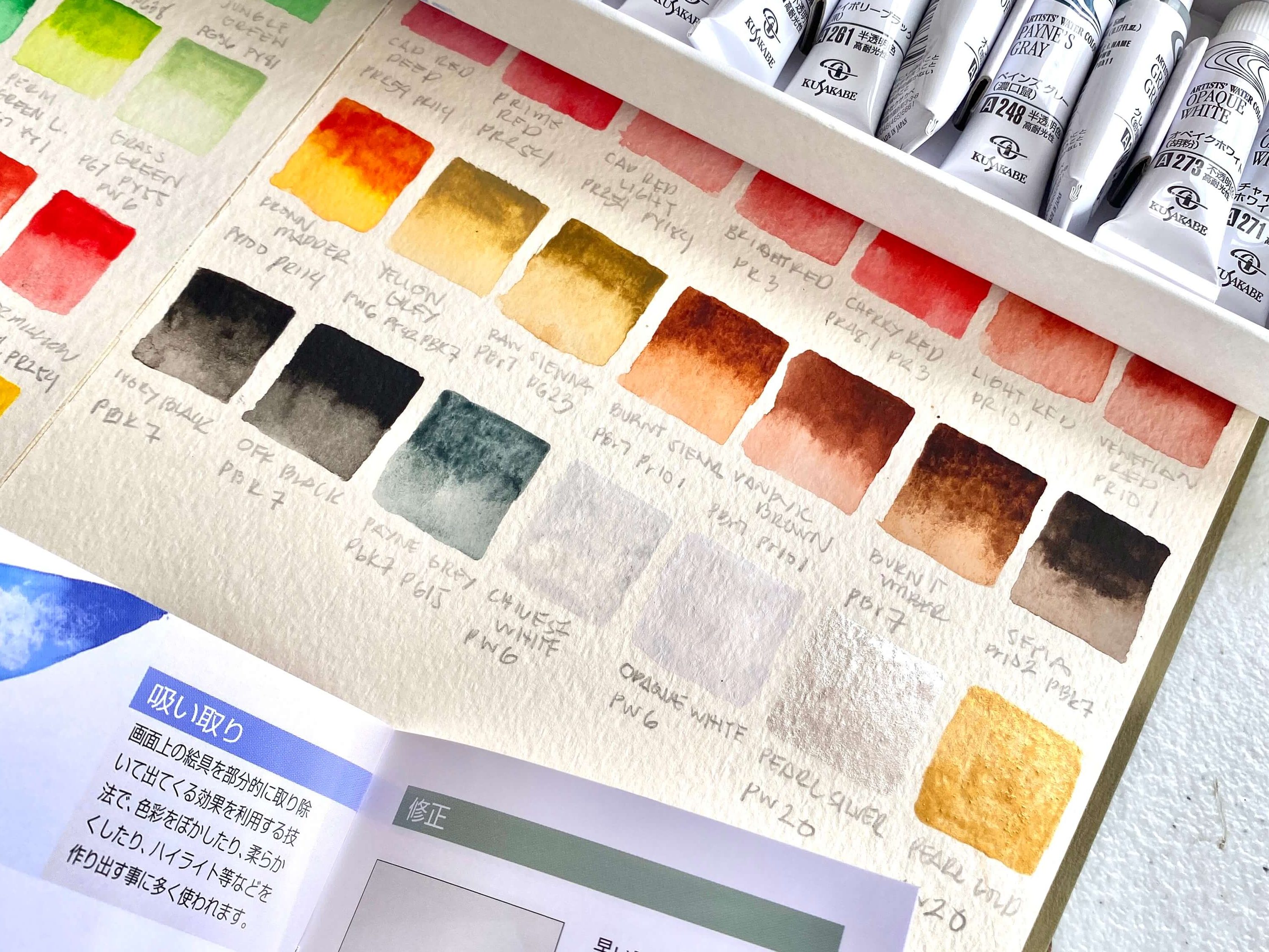
Nothing much I can comment about these colors because most of them are exactly as they should be in their western counterparts. It’s also nice that Kusakabe included a silver and a gold. It is a decent additional to my existing neutral colors.
Final thoughts:
I’ll categorize my final thoughts into pros and cons.
Pros
- Value for money relative to its similar counterparts from other brands
- lots of tints for people who likes pastels or rely on them
- interesting novelty colors
- does not use controversial pigments or pigments who are classified as “hazardous”.
Cons
- might not be for people who are used to traditional western watercolors
- unlisted pigments
- some of the convenience colors are poorly mixed
This set is a mixed bag for me but it definitely satisfied my cravings of owning a large set of colors. They are classified by the company as Artist grade and most of the pigments are actually lightfast. But, as is with most Japanese brands, it may still take you off-guard so reading the pigment labels is still a must.
Holbein Clester Watercolor Book
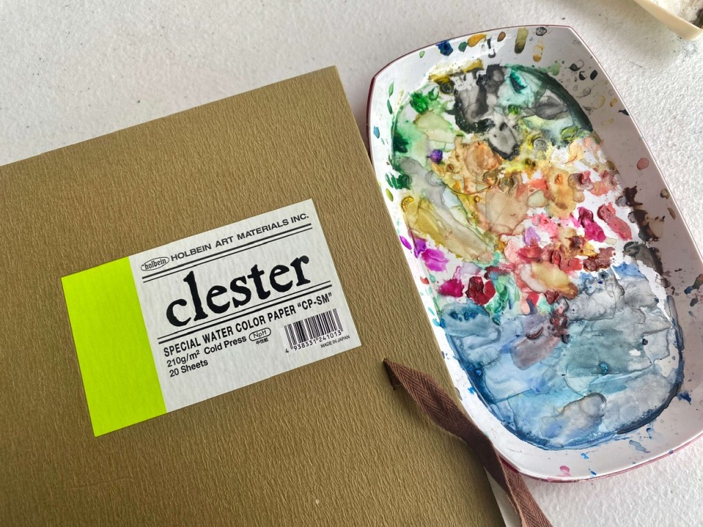
This watercolor paper is Japan exclusive manufactured by the Holbein Brand. It is in a sketchbook format glued in one side, 20 sheets, 210gsm cold pressed 100% cotton watercolor paper. It is wrapped in a greenish brown water resistant “Japanese paper-like” cover. It also has brown cotton ribbons on the middle of the back and front covers to help close it up. The overall packaging feels oriental, like a bamboo forest.
The paper texture has a slighter texture compared to other brands such as Arches or Fabriano. Holbein Clester is very similar to Strathmore watercolor papers. Granulation is quite evident and shows beautifully. The sizing is pretty excellent too and the pigments move beautifully either wet on dry or wet on wet. It takes masking fluid and rubbing well. You can check this link for actual performance.
Final thoughts:
It is a beautiful paper and performs smoothly as any artist grade watercolor paper. The cons? Not as accessible compared to the other brands because it is a Japan exclusive item.
See you in the next blog!

Leave a comment